GPT Image 2.5 packaging and typography prompts
Verified against OpenAI documentation on 2026-09-09
Packaging is typography with a fold in it. These GPT Image 2.5 packaging and typography prompts quote every word that appears on the pack, name the print finish that gives the surface its character, and describe the panel structure before the artwork. Work in flare while you explore the shape, then move the final piece to sunburst where the copy has to be right.
What makes these work
- 01
Quote every word that appears on the pack, in the order it appears. Unquoted copy comes back as invented text, and a label with three exact quoted lines beats one described as having brand information.
- 02
Name the print finish, because it is what makes packaging feel expensive or cheap. Letterpress bite into cotton stock, gold foil with a slight emboss, soft touch matte lamination and uncoated kraft all catch light differently.
- 03
Describe the die line and the panel structure before the artwork. Say the front panel is 60 by 90 millimetres, the neck band wraps separately, and the side panel carries the ingredients, then place the type into those panels.
- 04
State the surface and how it curves. A flat label lying on a scanner, a label wrapped around a bottle and a carton photographed at a three quarter angle each distort the type differently.
- 05
Explore in flare and finish in sunburst. Flare is fast enough to try ten label layouts, and sunburst is the model to run once the copy is final and every word has to render correctly.
8 prompts
Letterpress wine label
sunburst · xhigh · 1024x1536 · 30s
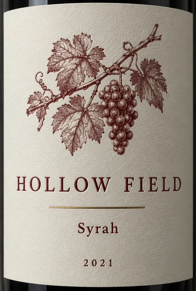
Front label for a red wine bottle, photographed straight on so the label reads flat with only slight curvature at the edges. The stock is thick uncoated cotton paper in warm ivory with a visible letterpress bite in every printed element. A fine engraved line drawing of a vine sits in the upper third. Below it the producer name reads "HOLLOW FIELD" in wide spaced serif capitals. A thin rule separates it from a line reading "Syrah". At the base a small line reads "2021". A deep burgundy ink is used throughout, with one small area of matte gold foil on the rule. Light rakes from the upper left so the impression depth casts a real shadow inside each letter.
Letterpress only reads as letterpress when raking light reveals the depression, so the light direction is specified. Three short quoted lines is a realistic text load for a label that has to be legible.
Coffee bag flat artwork
sunburst · high · 1536x1024 · 28s
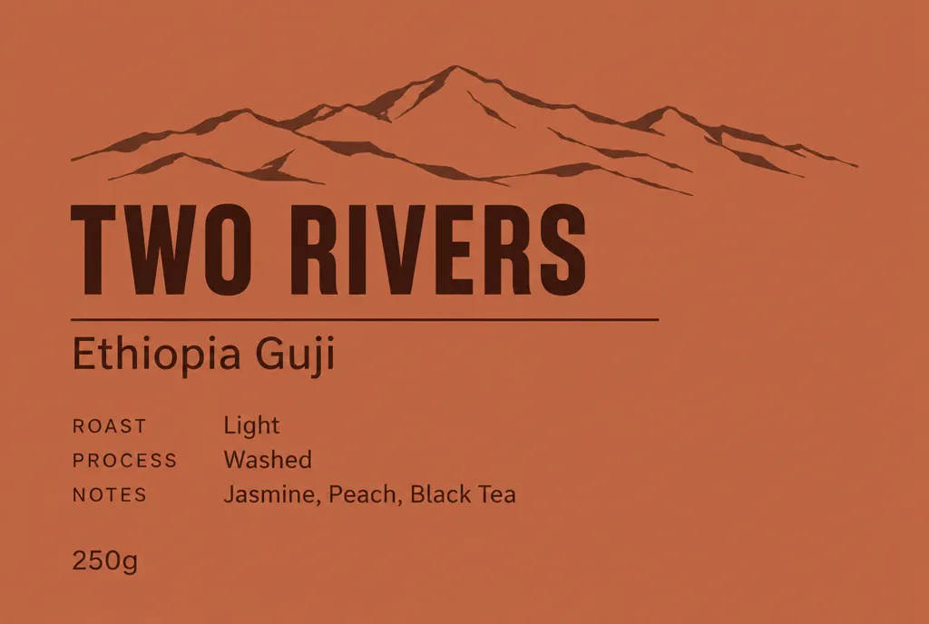
Flat artwork for a coffee bag front panel, shown as a rectangular composition with no bag shape, no folds and no perspective. Background is a warm terracotta flood colour on matte stock. A bold condensed sans wordmark near the top reads "TWO RIVERS". Beneath it a thin horizontal rule, then a smaller line reading "Ethiopia Guji". Lower down a three row information block with small uppercase labels and short values, the labels reading "ROAST", "PROCESS" and "NOTES". At the base a line reads "250g". A simple two colour line illustration of a mountain ridge sits behind the wordmark in a slightly darker tone. Left aligned type throughout with a consistent left margin.
Asking for flat artwork rather than a photographed bag gives you a panel you can actually take into a die line. Stating one shared left margin is what makes the type block look set rather than scattered.
Tea tin lid design
flare · high · 1024x1024 · 27s
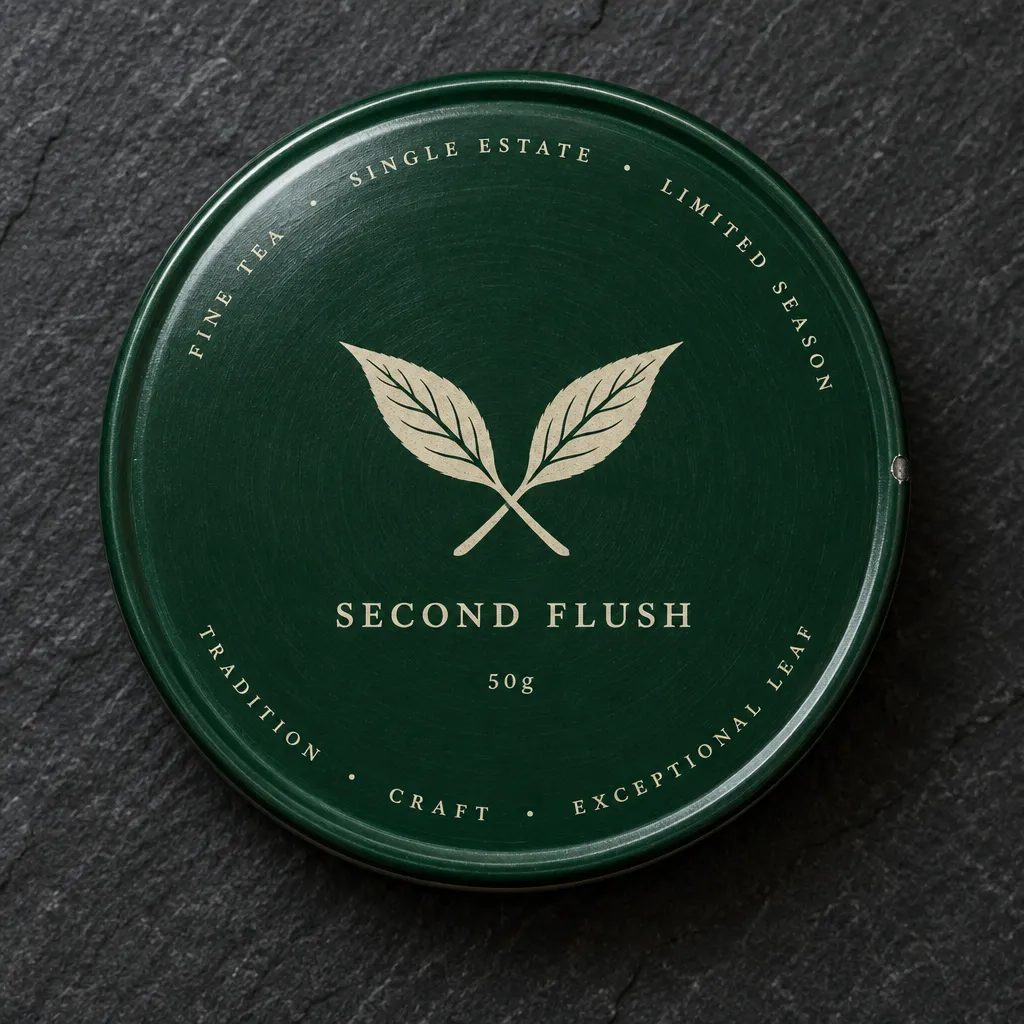
Top down photograph of a round tinplate tea tin lid, 90 millimetres across, sitting on a dark slate surface. The lid is printed in a deep forest green with a slightly satin varnish and a shallow embossed rim. A circular band of small capitals runs around the outer edge. In the centre a symmetrical botanical mark of two crossed leaves is printed in cream. Directly beneath the mark a short line reads "SECOND FLUSH". A tiny line under that reads "50g". The tin shows faint circular brush marks in the metal beneath the ink and a small nick on the rim. Soft overhead light with one broad highlight arcing across the lid.
Circular type around a rim is hard to render, so only the centre lines are quoted and the band is left as unspecified small capitals. The nick and brush marks stop the tin reading as a flat vector mockup.
Paperback book cover
sunburst · xhigh · 1024x1536 · 27s
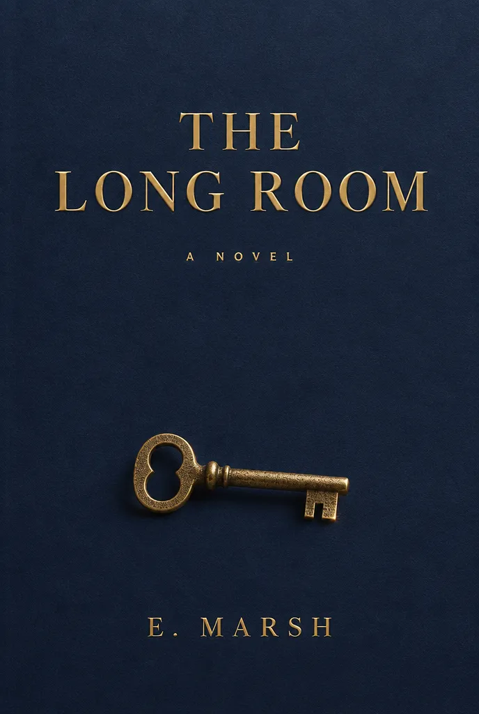
Front cover of a trade paperback, shown flat with no spine and no perspective, printed on soft touch matte laminate stock. The composition is mostly empty deep navy with a single small object in the lower third: a brass key rendered in fine stipple, lit from the right. The title sits in the upper third in a high contrast serif, set in two lines, and reads "THE LONG ROOM". Well below it a smaller line in wide spaced capitals reads "A NOVEL". At the very bottom the author line reads "E. MARSH". Title and author are printed in matte gold foil with a slight emboss catching a soft top light. Fine grain visible in the navy field.
Book covers work through vertical position, so the prompt places title, subtitle and author in named thirds. Foil is described as catching a light source, since foil without a specified light just reads as flat yellow.
Concert ticket stub
flare · high · 1536x1024 · 26s
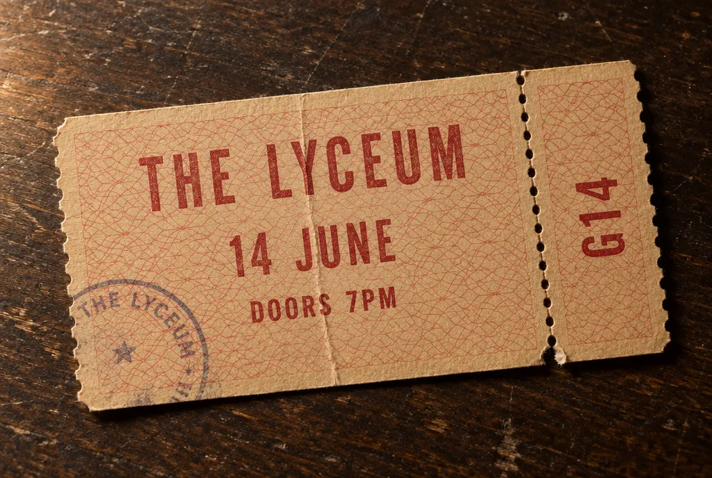
Perforated concert ticket photographed flat on a scuffed dark wood surface, slightly angled. The stock is thin uncoated card in pale amber with a fine guilloche security pattern printed in dull red. A vertical perforation line divides a wide main panel from a narrow stub on the right. The main panel carries a venue name in condensed capitals reading "THE LYCEUM", a date line reading "14 JUNE", and a smaller line reading "DOORS 7PM". The narrow stub repeats only a seat line reading "G14" set vertically. A faint circular ink stamp overlaps the lower left corner. The card shows a soft crease and one torn perforation tooth. Warm side light with soft shadow.
A ticket is defined by its perforation, so the panel split is described before any copy is placed. Repeating only the seat number on the stub is how real tickets work and it keeps the text load low.
Soap carton die line
flare · high · 1536x1024 · 27s
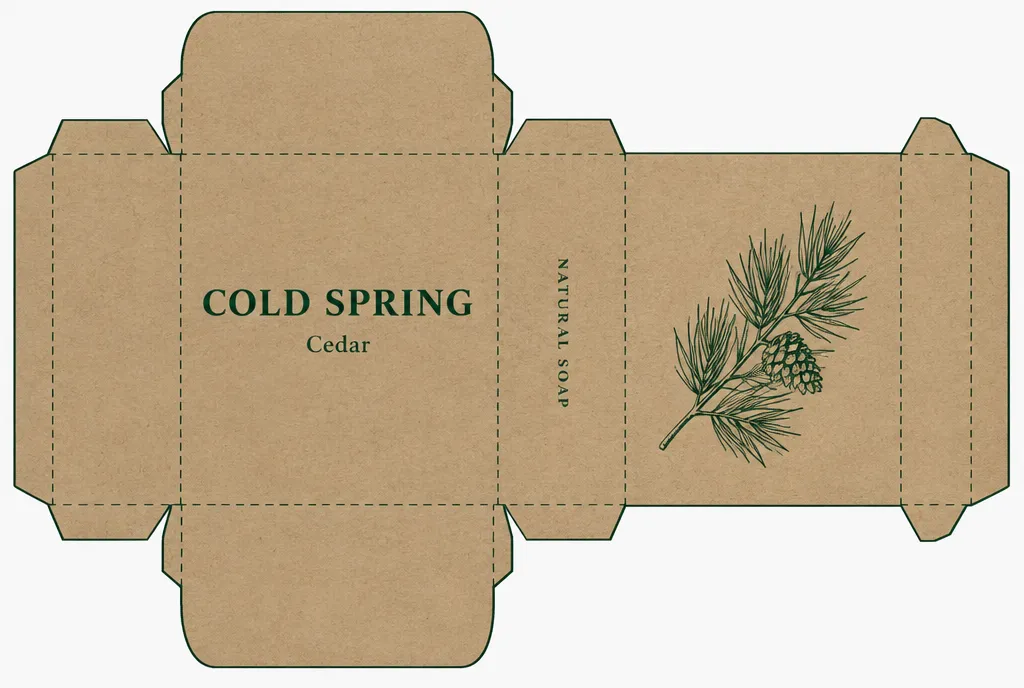
Unfolded soap carton die line laid flat, shown straight on as a technical layout with visible fold lines drawn as dashed rules and cut edges as solid rules. The carton has a front panel, two side panels, a back panel and top and bottom tuck flaps. The stock is uncoated kraft board printed in a single dark green ink. The front panel carries a centred wordmark reading "COLD SPRING" with a small line beneath reading "Cedar". One side panel is left entirely blank for ingredients. The other side panel carries a short vertical line of small capitals. The back panel holds a simple line illustration of a pine branch. Type aligns to a shared baseline across all panels.
Naming which rules are dashed and which are solid produces a die line a production person recognises. Leaving one panel deliberately blank gives you somewhere to place real ingredient copy afterwards.
Hot sauce bottle label
flare · high · 1024x1536 · 26s
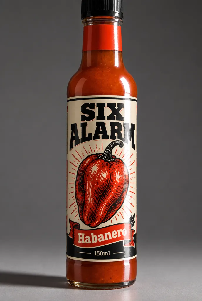
Woodward style hot sauce label wrapped around a slim glass bottle, photographed at a slight three quarter angle so the type curves away at both edges. The label is printed on gloss coated paper in three flat colours: black, a hot vermilion and cream. A dense engraved illustration of a chilli fills the centre. Above it a heavy slab serif wordmark reads "SIX ALARM". Below the illustration a banner ribbon carries a line reading "Habanero". A small line at the base reads "150ml". A narrow neck band in solid vermilion wraps separately above the main label. Hard studio light from camera right gives the glass a bright edge and the gloss label a sharp specular band.
Type wrapped on a cylinder needs the angle stated or the label renders flat and pasted on. The neck band is called out as a separate wrap because it is a separate piece of artwork in production.
Kraft shipping carton
flare · medium · 1024x1024 · 20s
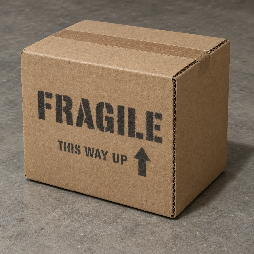
Plain kraft corrugated shipping carton photographed at a three quarter angle on a concrete floor, lit by a single overhead source. The board is unbleached brown with visible flute edges at the open corner and a slightly fuzzy printed edge from ink soaking into uncoated fibre. One large single colour stamp in charcoal sits on the front face and reads "FRAGILE" in stencil capitals. A smaller stencil line beneath reads "THIS WAY UP" alongside a simple upward arrow pictogram. Brown paper tape runs along the top seam with the fibre threads showing. The rest of the carton stays unprinted. Shadow falls short and slightly behind. No branding, no gloss, no colour beyond kraft and charcoal.
Ink soaking into uncoated fibre is why stencil marks on kraft look slightly furry, and naming that effect is more useful than asking for a realistic box. Most of the carton is left unprinted on purpose.
Frequently asked questions
Why does my pack copy come back as nonsense words?
Almost always because it was described rather than quoted. Write out every line that appears on the pack inside quotation marks, in the order it appears, and keep each line to a few words. Long ingredient lists and legal copy are where letters start to break down, so leave a blank panel for them and set that text properly later.
Which model should I use for final packaging artwork?
Use gpt-image-2.5-sunburst for the final piece, since it is the slower model tuned for exact text and precise edits. Use gpt-image-2.5-flare while you are still trying layouts, because it is fast enough to run ten variations of a panel structure before you commit to one and spend the time on a clean render.
How do I make a print finish look real?
Give the finish a light source to react to. Letterpress needs raking light so the impression casts a shadow inside the letters. Foil needs a stated light direction so it reads as metal rather than flat yellow. Soft touch matte needs an absence of specular highlight. Naming the finish alone rarely does it on its own.
Should I ask for a flat panel or a photographed pack?
Ask for flat artwork when you want something you can take into a die line, and say no folds and no perspective explicitly. Ask for a photographed pack when you are presenting the idea, and state the camera angle and how the label curves. Trying to get both from one prompt usually gives you a compromise that serves neither.
Can I keep the same label and change one word?
Yes, and this is where the model earns its keep. GPT Image 2.5 handles multi-turn editing more reliably than the previous generation, so you can keep an approved label and ask for a new variant name or a different weight line. Run that follow up on sunburst, which is built for precise edits.
How much text can one pack panel carry?
Three to five short quoted lines per panel is a comfortable working limit. A wordmark, a variant name and a weight line will usually hold. Beyond that, split the copy across panels or leave a side panel empty. Real packaging does exactly this, so designing to that constraint tends to produce a better looking pack anyway.